Currency Glyphs
Feb 2026
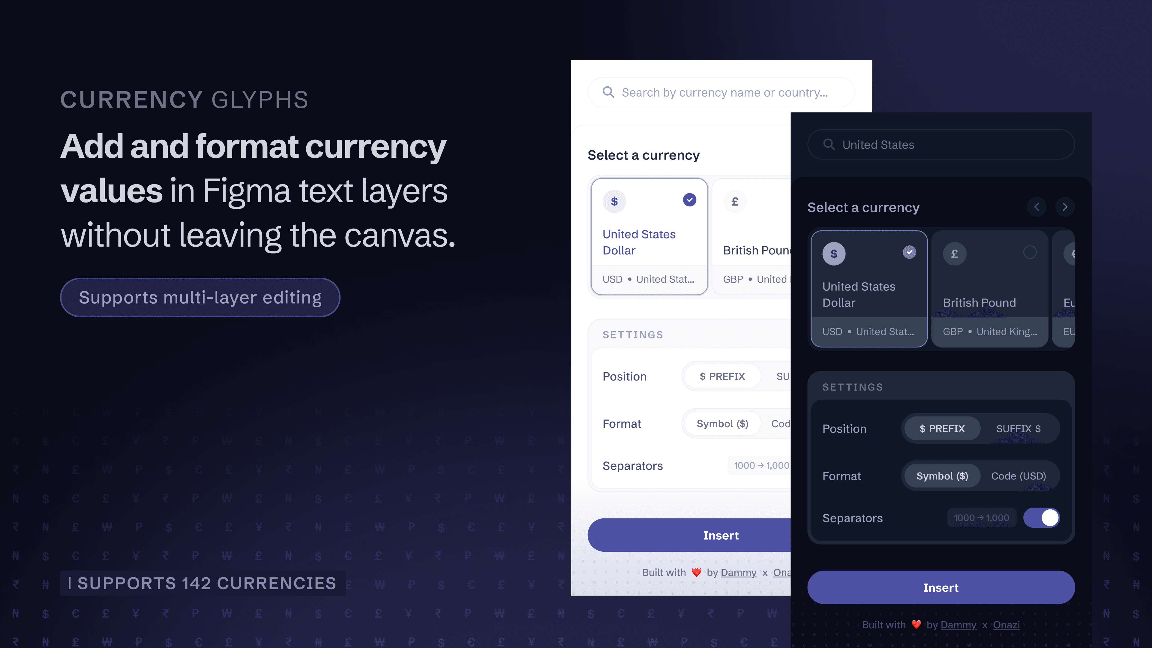
Currency Glyphs is a Figma plugin that helps designers to insert and format currency values directly inside text layers without leaving the canvas. It supports 142 currencies and enables symbols or ISO codes to be applied as prefixes or suffixes while preserving existing typography, colour, and text content.
The plugin also formats digits with comma separators, respects decimal values, and works across multiple selected text layers without overwriting individual amounts.
The Problem
While designing interfaces, presentations or decks, I repeatedly ran into a small but persistent friction: many currency symbols are not available on standard keyboards. The workflow typically involved searching Google, copying a symbol, and pasting it into Figma.
The interruption seems minor, but in practice it breaks flow, introduces inconsistency, and slows iteration while working.
I built Currency Glyphs to remove this friction and make currency formatting behave like a native part of Figma's text editing.
What the Plugin Does
The plugin allows designers to:
- Insert currency as symbol ($, £, ₦) or code (USD, GBP, NGN)
- Apply currency as a prefix or suffix
- Automatically format thousands separators and preserve decimals
- Edit multiple text layers simultaneously
- Preserve existing typography styles and colours
- Maintain each text layer's original numeric value (e.g. 1,000 and 500 become $1,000 and $500, not duplicated values)
Approach
I began by defining the full feature set and system behaviour before touching the interface. I worked with Claude to generate an initial codebase, then ran and tested the plugin locally in Figma through Cursor.
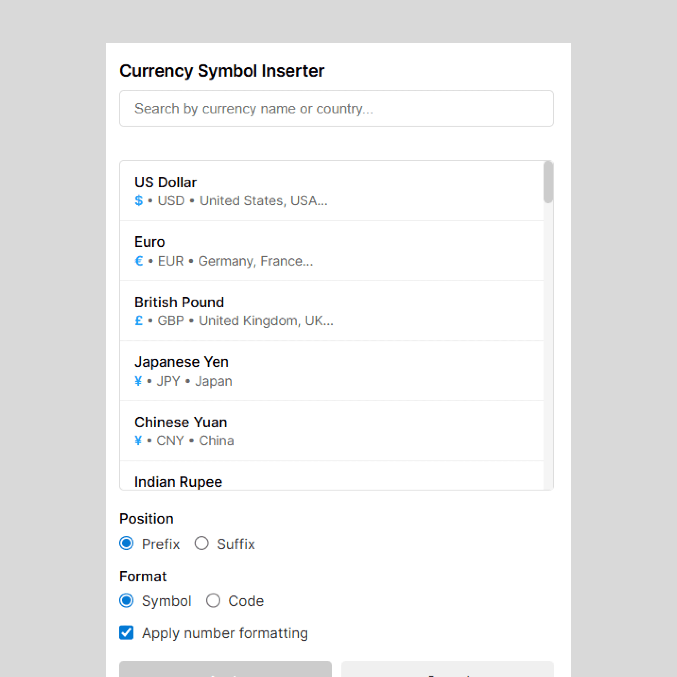
The functionality worked early, but the default interface was minimal and not suitable for real use. From there, the focus for me moved beyond functionality to craft; shaping the layout, states, and visual details so the plugin would feel coherent and intentional.
I redesigned the entire interface, creating:
- search and filtering states
- selection behaviour
- input handling states
- prefix/suffix configuration
- symbol vs code switching
Interface Design Decisions
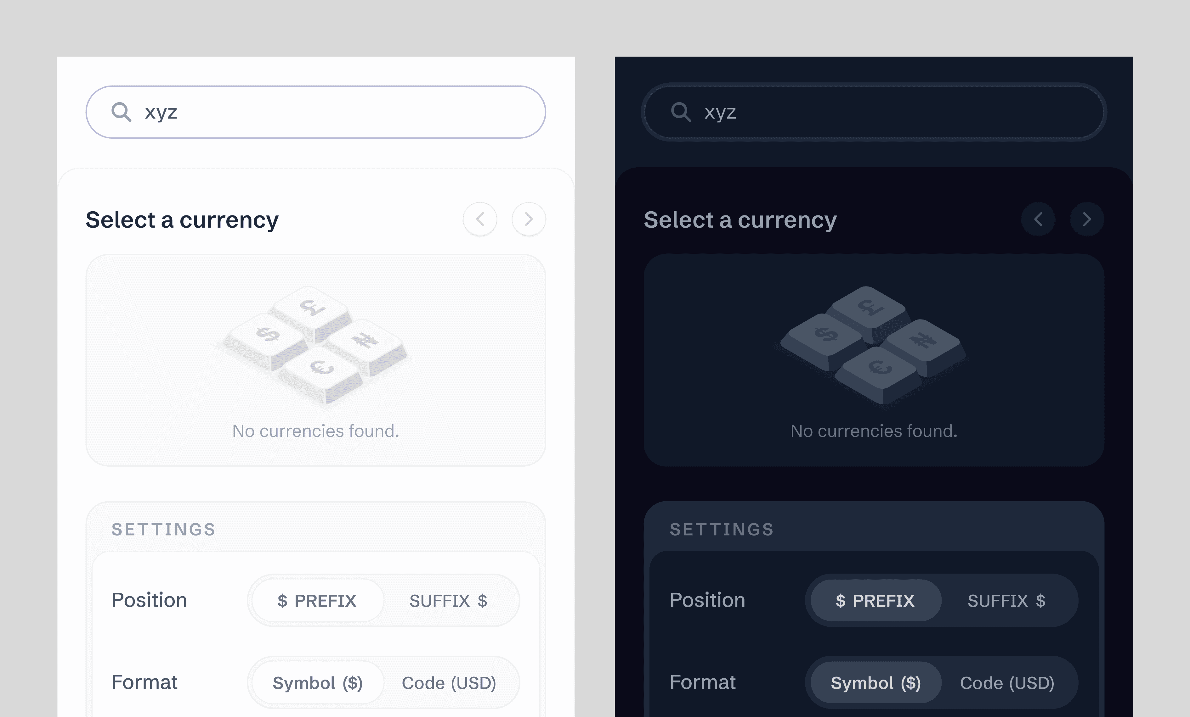
Empty State — I designed a custom illustration showing currencies on keyboard-like keys. This communicates the core value of the plugin; accessing symbols you cannot type directly.
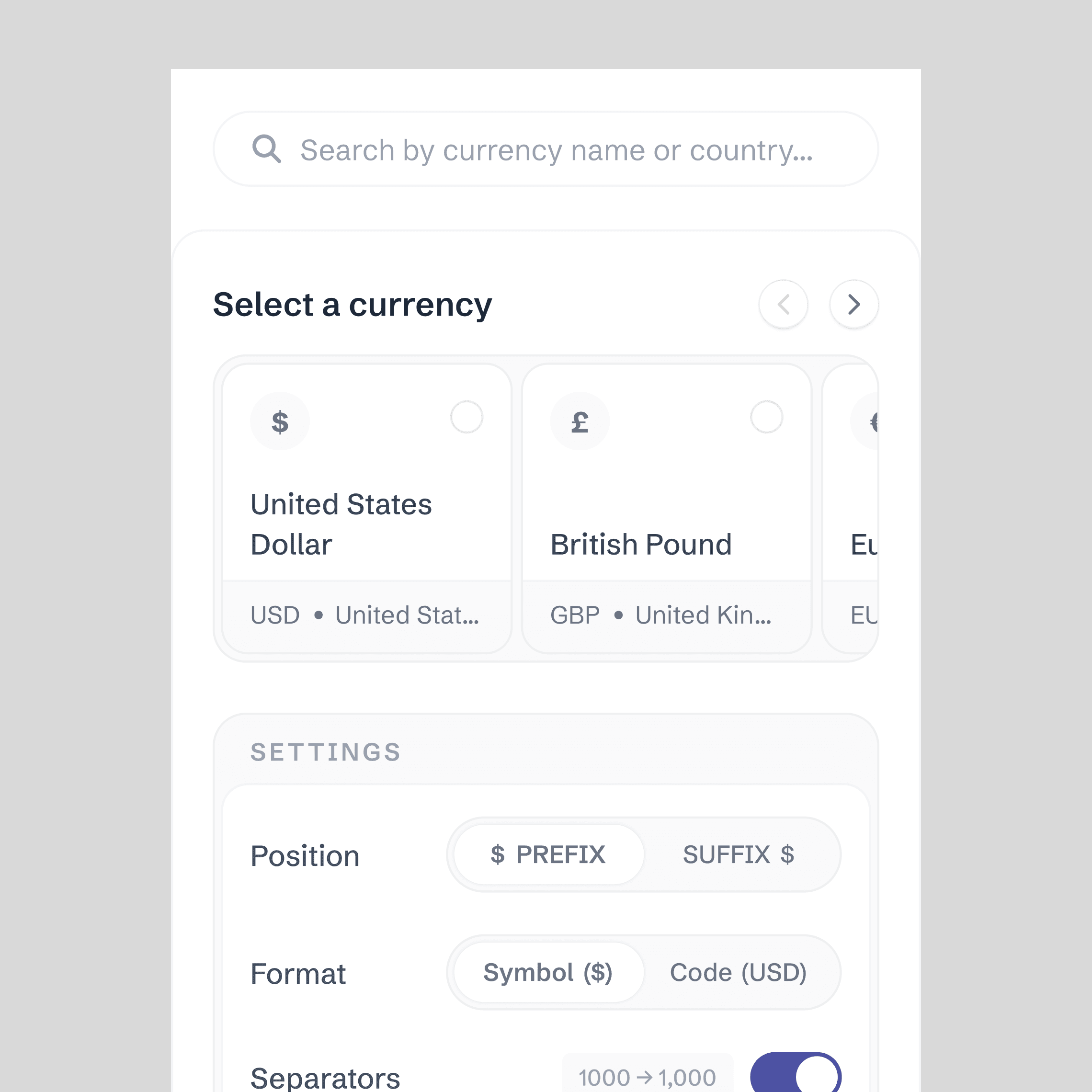
Layout Structure & Alignment — The interface follows strict vertical alignment rules to maintain consistency across list items, controls, and input areas. This created a clear visual rhythm and ensured the plugin felt cohesive even within a constrained space.
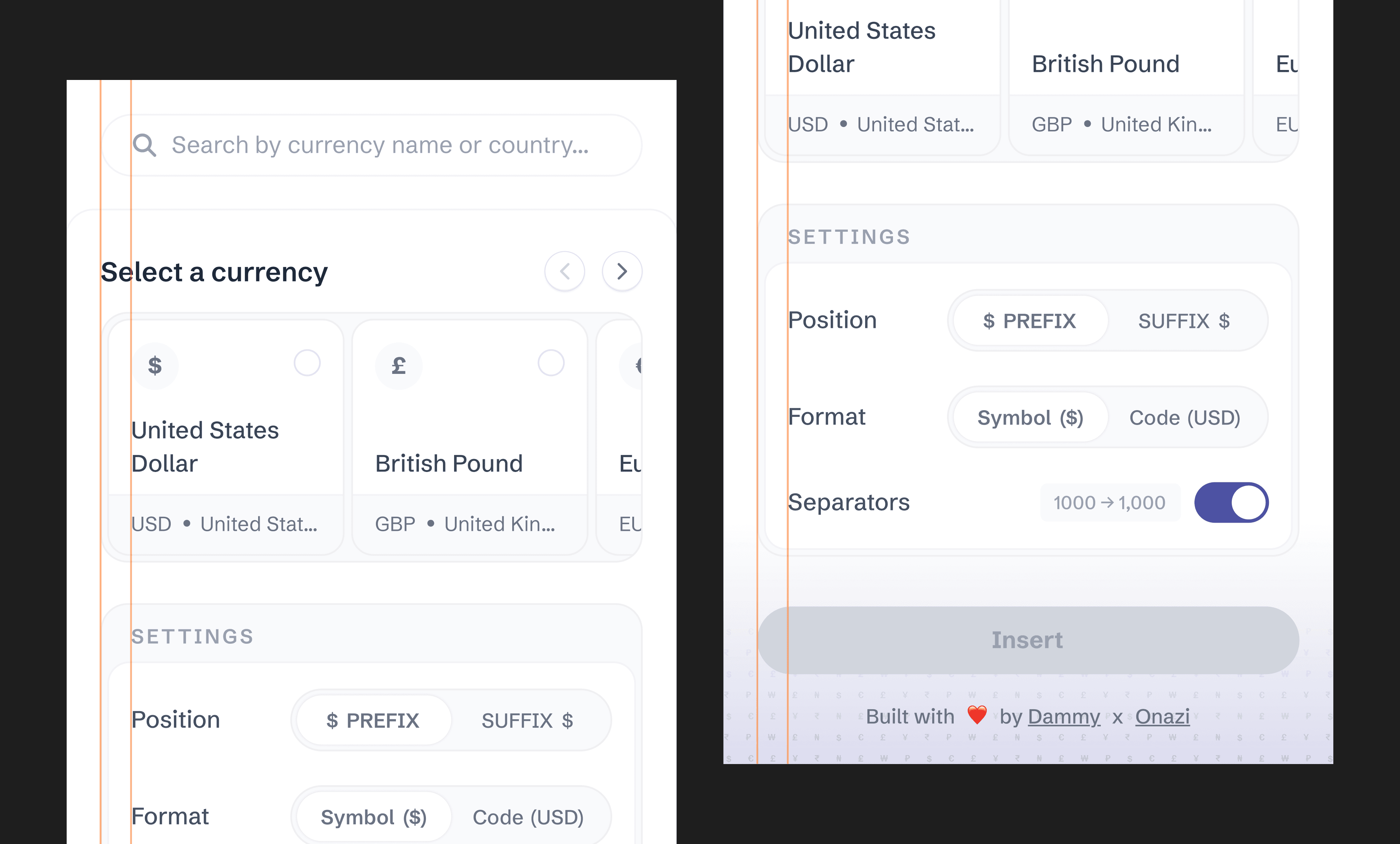
Country-Aware Search Behaviour — Some currencies are shared across multiple countries (for example, the euro). Searching for a specific country reorders the results so the queried country appears first within that currency group. This reduces scanning effort and helps users quickly confirm they've selected the correct context, especially when working across multiple regions.
Context-Responsive Settings — The settings panel updates dynamically based on the selected currency. When a currency is chosen from search results, the corresponding symbol or ISO code automatically appears in the configuration controls. This keeps the interface in sync with the user's selection and removes the need for manual switching, reducing errors and unnecessary steps.
Subtle Patterning — A faint repeating grid made of currency symbols sits at the base of the interface. It visually anchors the plugin while reinforcing its purpose without distracting from the workflow.
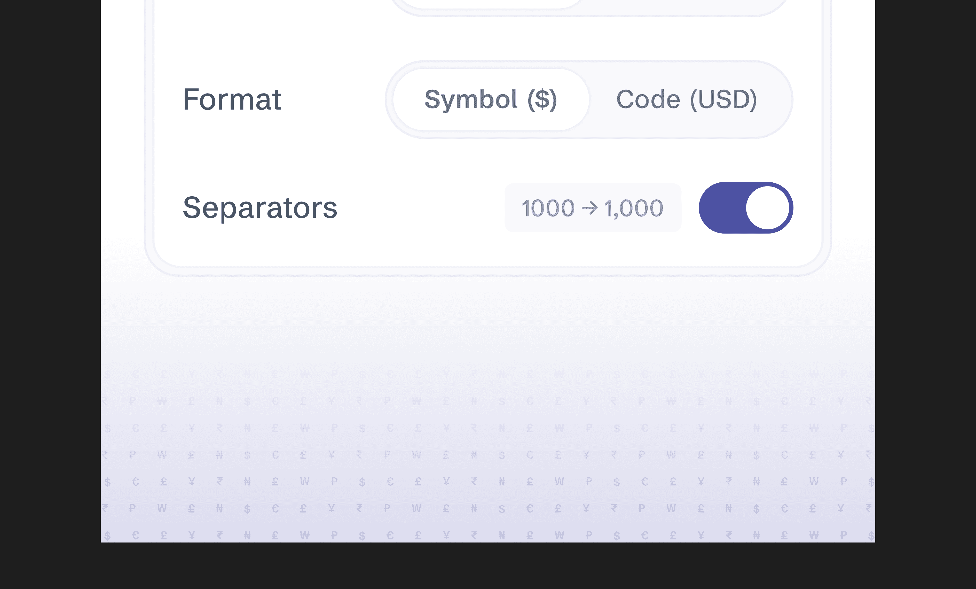
Light and Dark Mode — The UI adapts to Figma's theme, ensuring it feels native rather than external.
Constraints & Challenges
Plugin Size Constraints — My first interface was designed at a 420px width, which made the plugin view a larger window. After researching typical plugin dimensions (~320 × 480px), I redesigned the layout multiple times to reduce visual weight while retaining functionality.
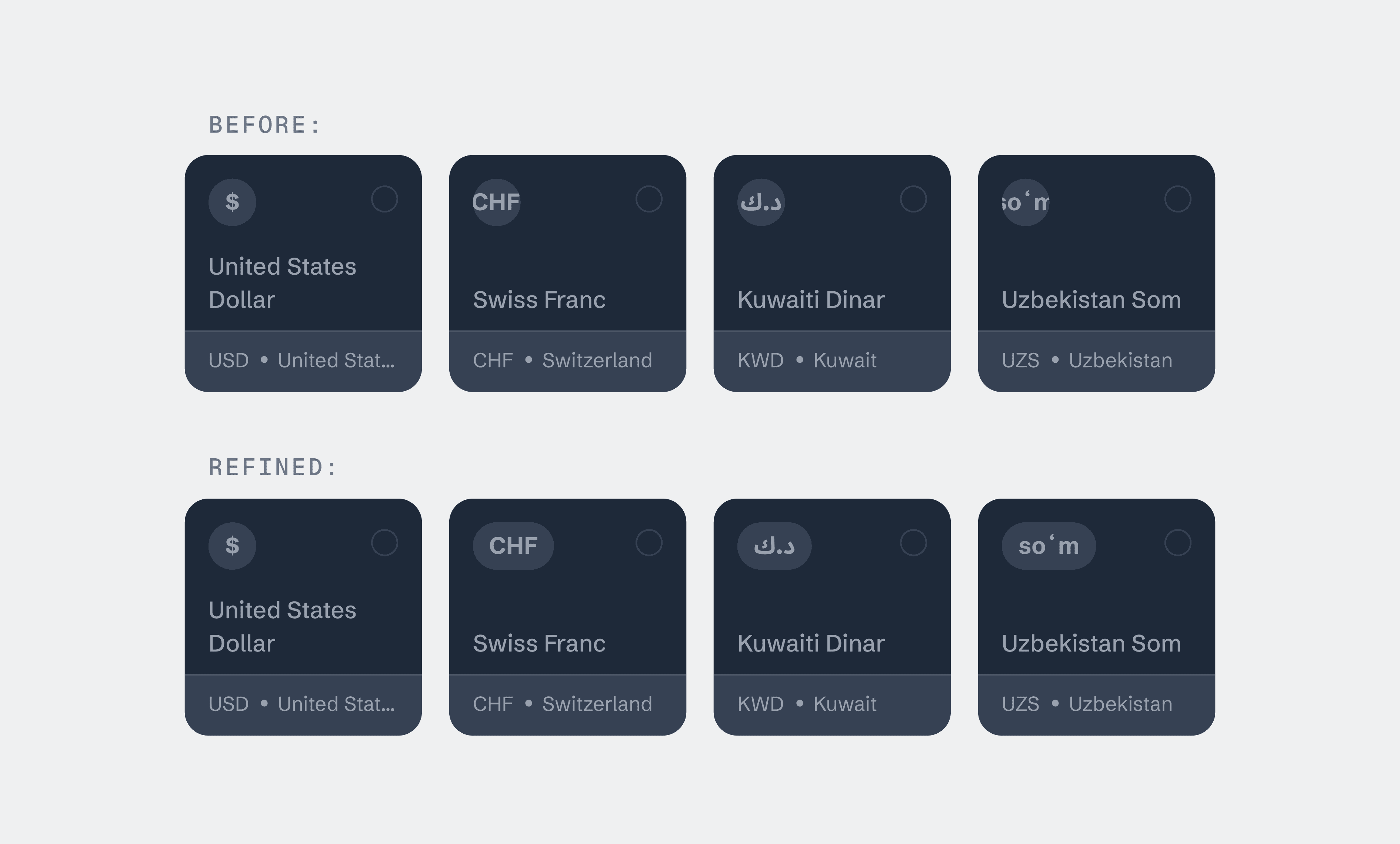
Edge Cases — During testing I discovered some currency symbols vary significantly in width. The layout had to accommodate wide glyphs without breaking alignment or truncating values, which required restructuring the UI and spacing logic.
Implementation — As a non-technical designer, setting up Git, GitHub, and local plugin environments was initially challenging. Some UI behaviours also did not translate perfectly during implementation, so I collaborated with a frontend developer to help with some engineering fixes to ensure the interface correctly matched with the design.
Iteration & Testing
After stress-testing, I made several changes:
- Reduced overall frame size
- Adjusted typography scale
- Reworked container spacing
- Improved multi-selection behaviour
- Refined input handling
Credits
Onazi Daniel — Frontend Engineer